
|
|
|
|
by Editor Miro Susta
Edited and published by Yvette Depaepe, the 10th of October 2025
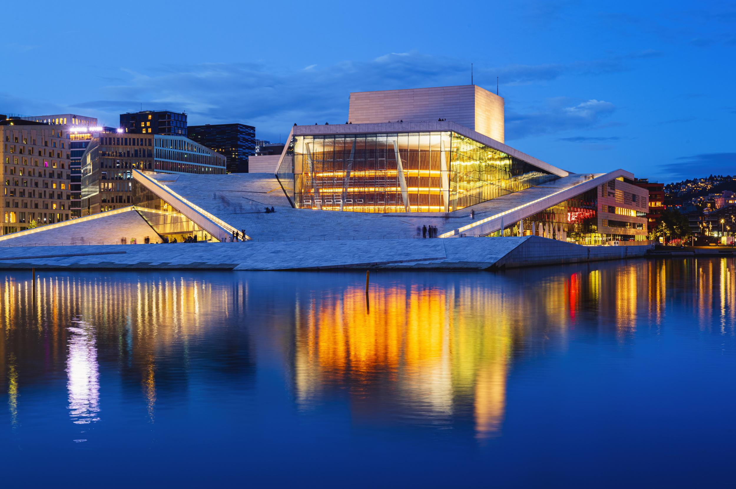
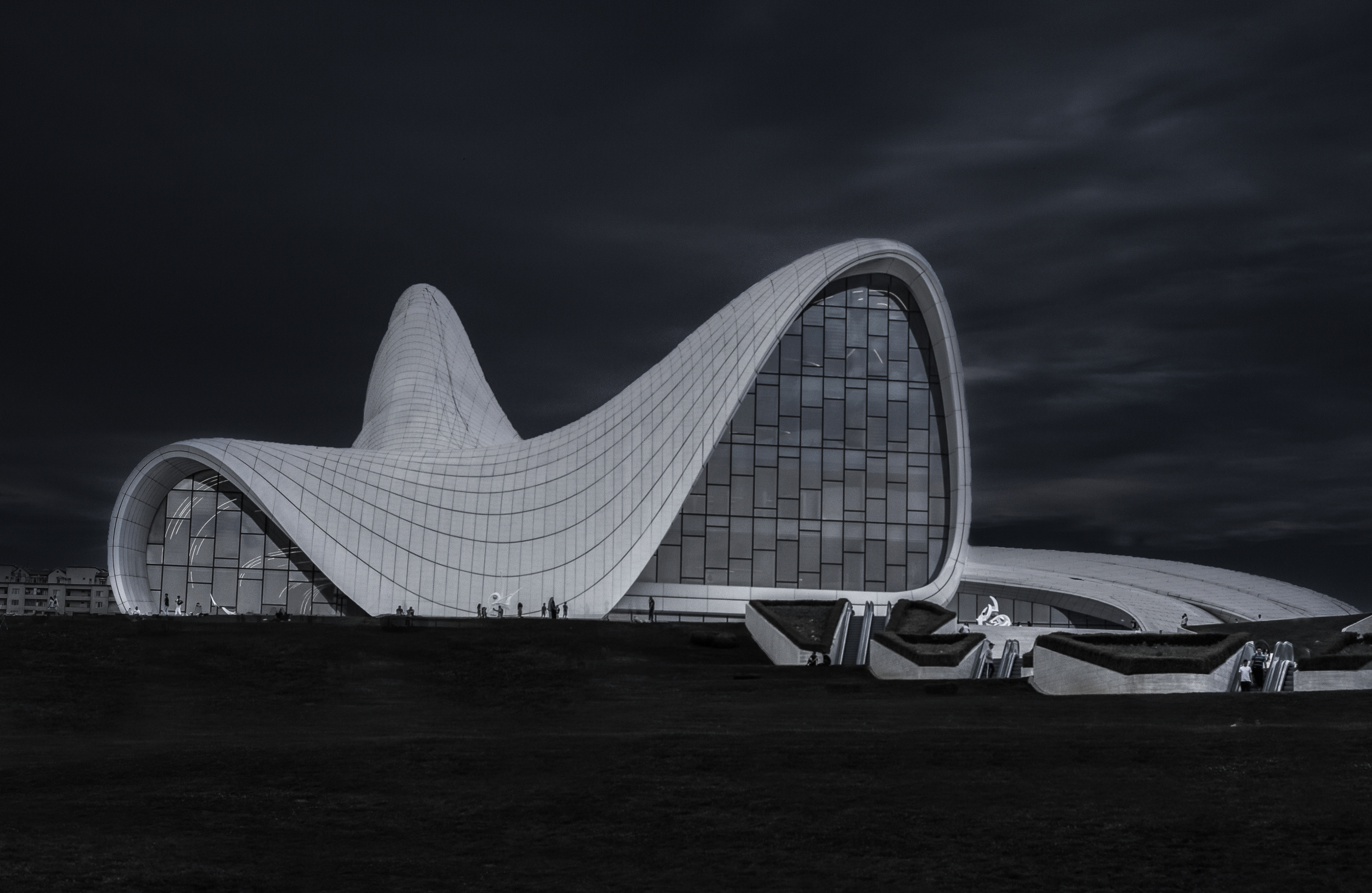
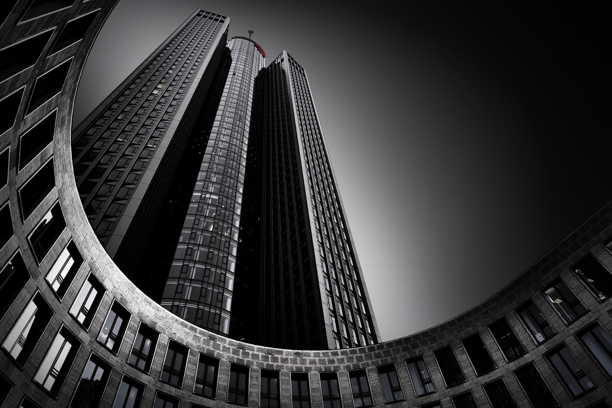
‘Oslo Opera House Deep Blue’ by LIANG CHEN
Our fixation on sharpness and contrast through large apertures has caused us to overlook the alternatives.
Contrast is also an excellent subject for photographic compositions, as it can transform subjects that would otherwise appear ordinary and mundane.
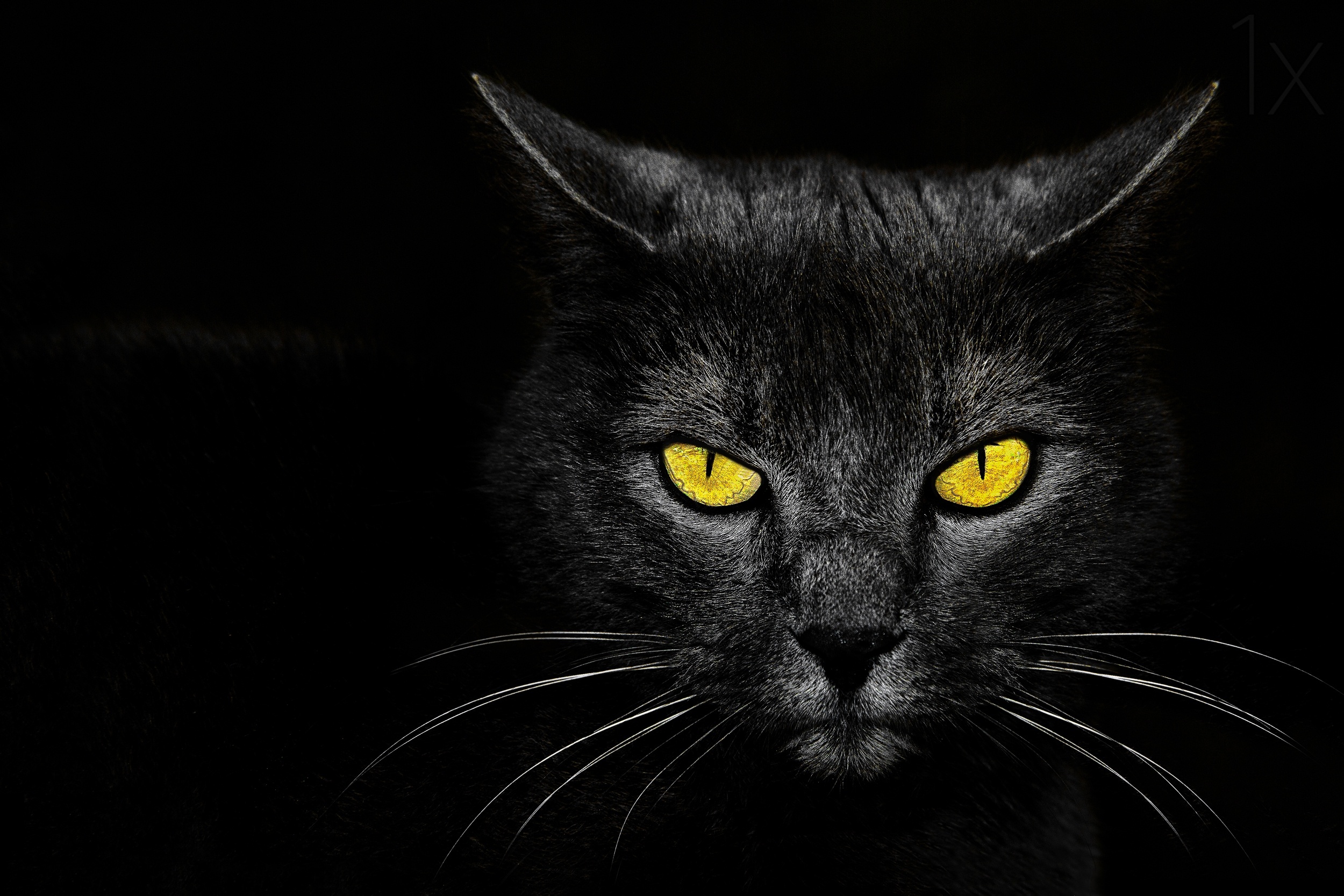
‘Black Cat’ by Davorin Baloh
In photography, contrast refers to the visual difference between various elements in an image, such as brightness, colour, structure, temperature (cold or warm), direction, sharpness, texture, shape and quantity. There is also simultaneous contrast.
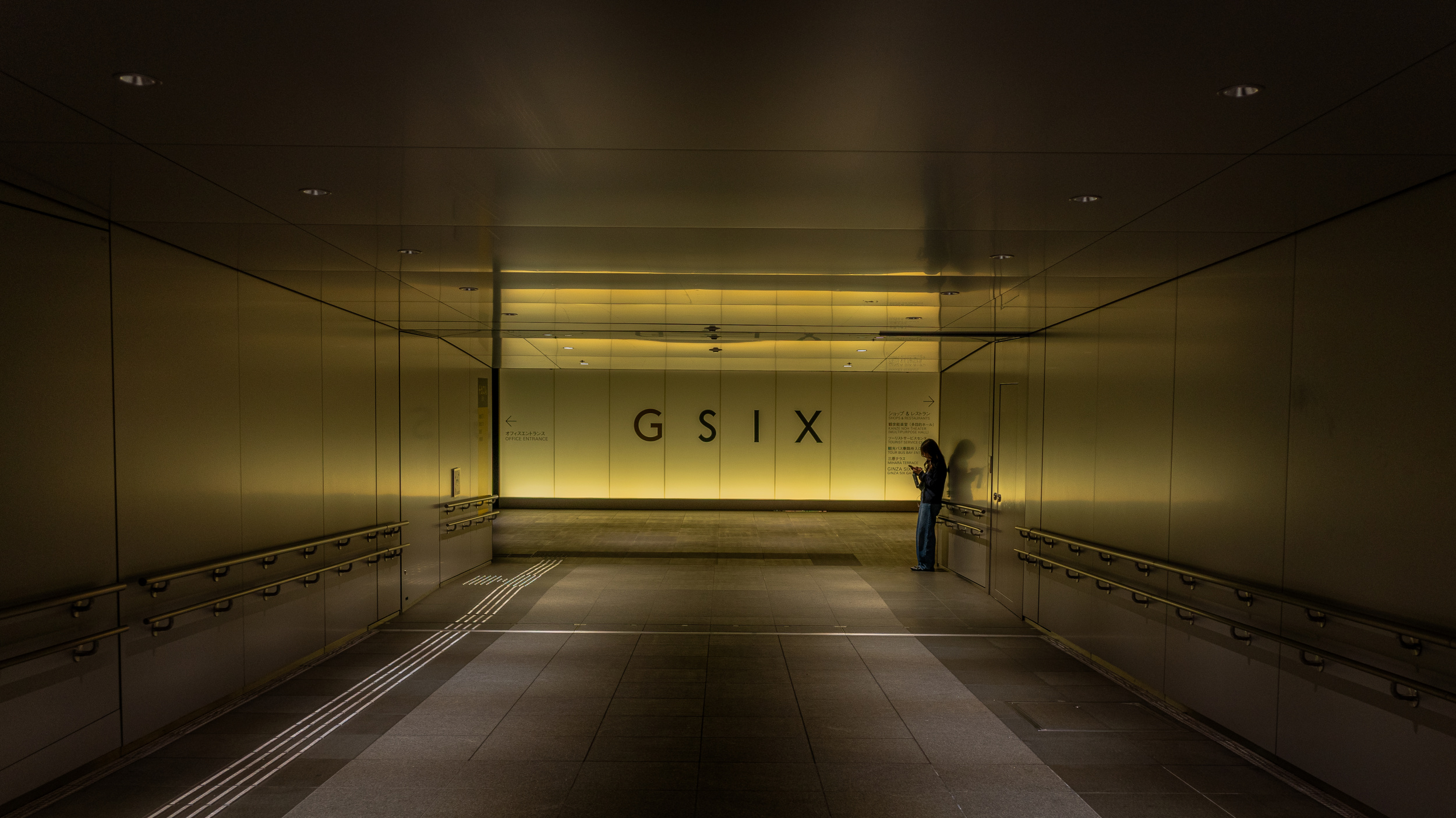
‘Paused in the Glow’ by Yohei Kawashima
It is an important design tool for directing the viewer's attention, setting the mood and emphasising details. Higher contrast tends to appear more energetic, while lower contrast appears gentler.
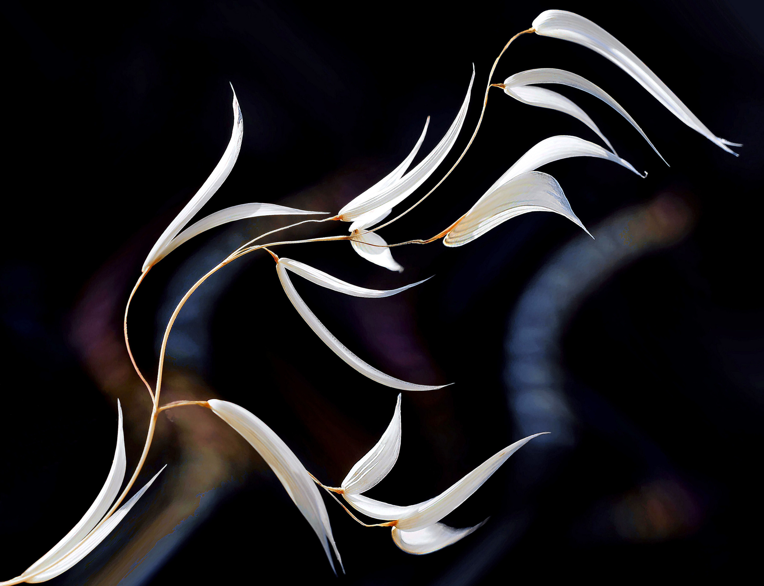
‘The voices of nature...’ by Thierry Dufour’
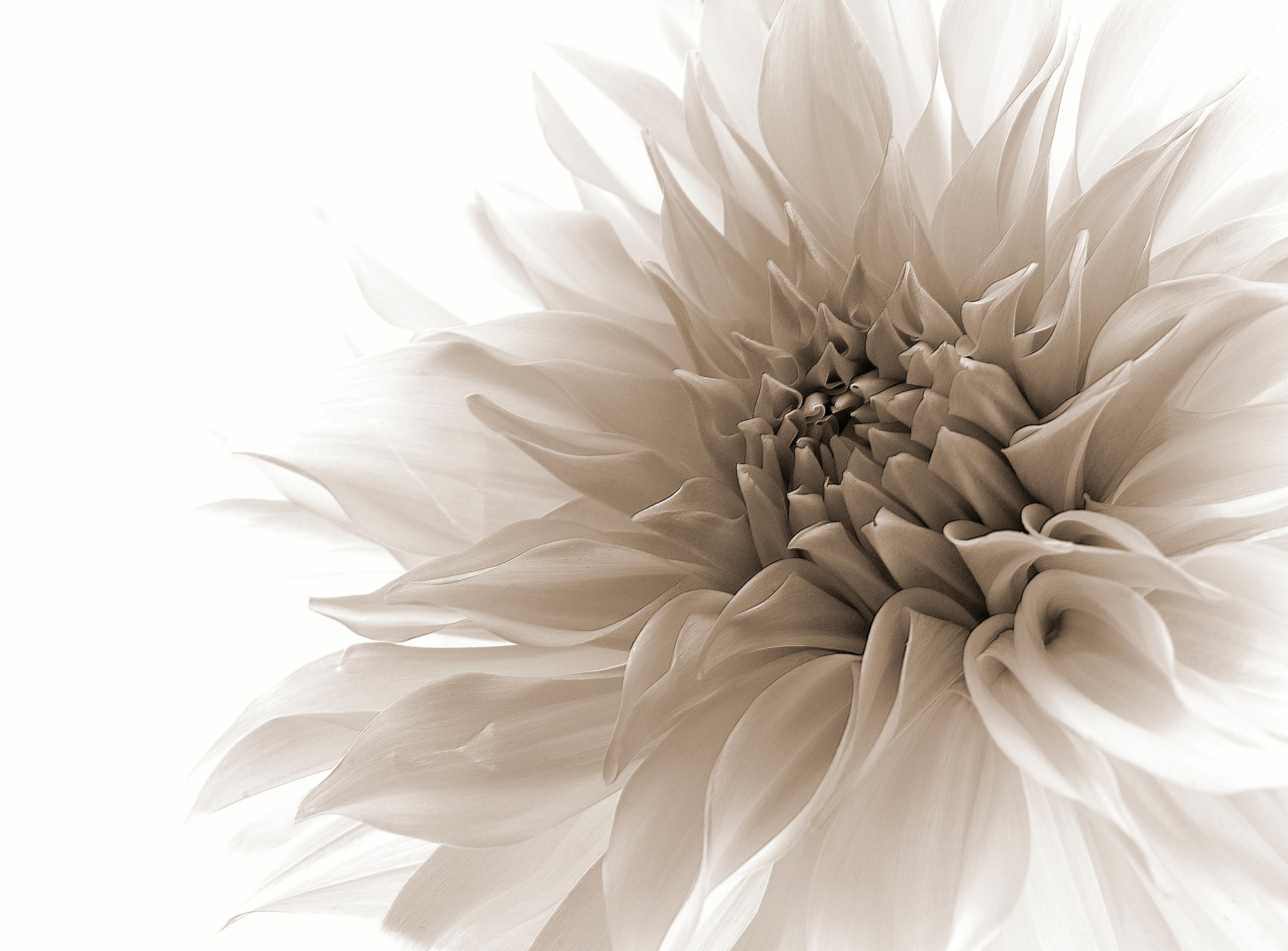
For example, tonal contrast refers to the brightness of the different elements within an image. If a photo contains extremely bright and dark areas, it is said to have sharp contrast. If there is a wide range of tones, from pure white to pure black, the contrast is medium.
‘Tonality’ by Margareth Perfoncio
Let us explore the following types of contrasts.
· Brightness contrast.
· Color contrast.
· Structural contrast
· Cold-warm contrast.
· Direction contrast.
· Sharpness contrast.
· Texture contrast.
· Shape and perspective contrast.
· Quantity contrast.
· Simultaneous contrast.
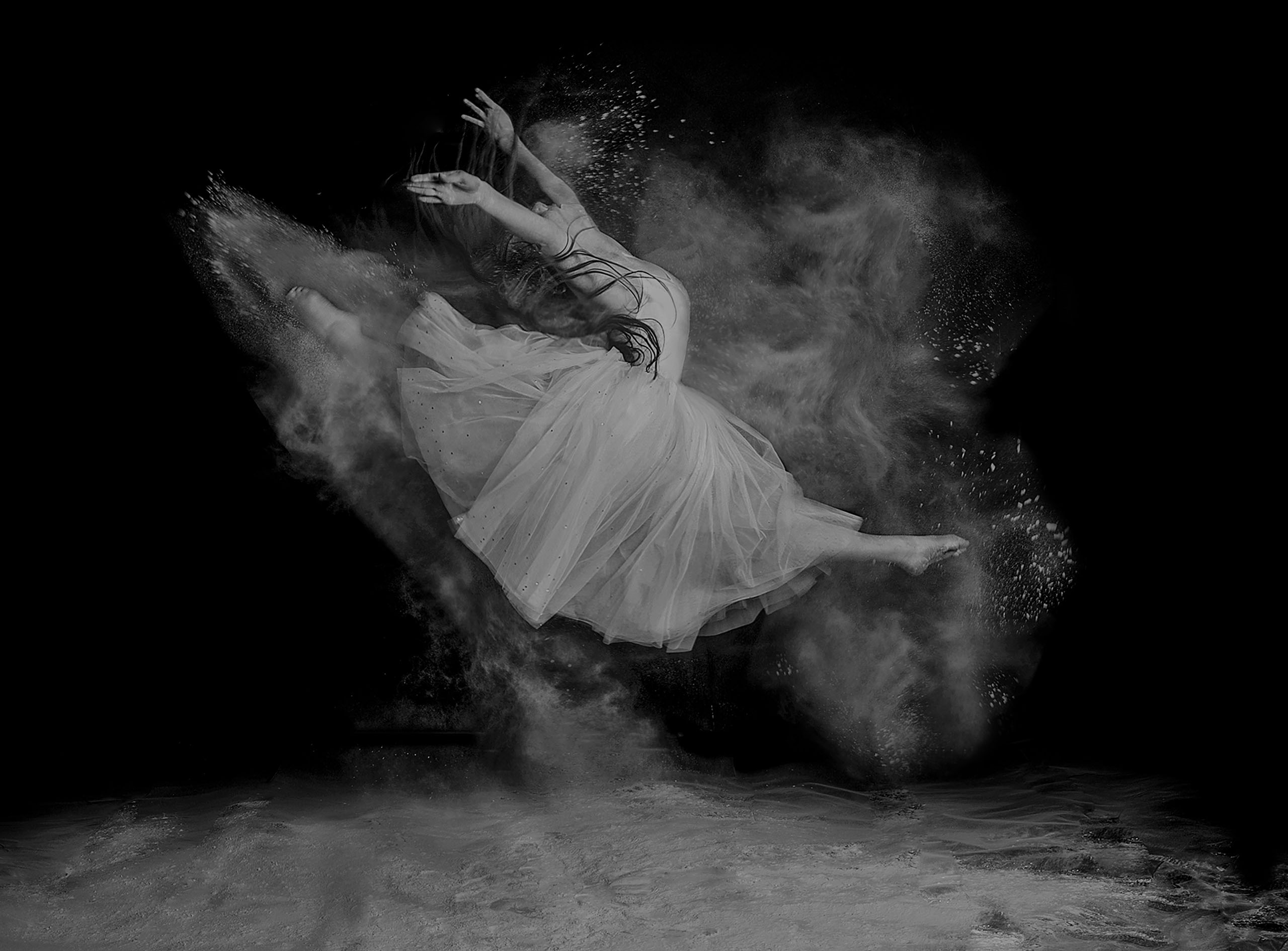
BRIGHTENESS CONTRAST …
This applies to the difference between light and dark areas of a picture. A photo with significant differences between its lightest and darkest tones is described as a high-contrast photo.
BETWEEN SHADOWS by Patrick Ems
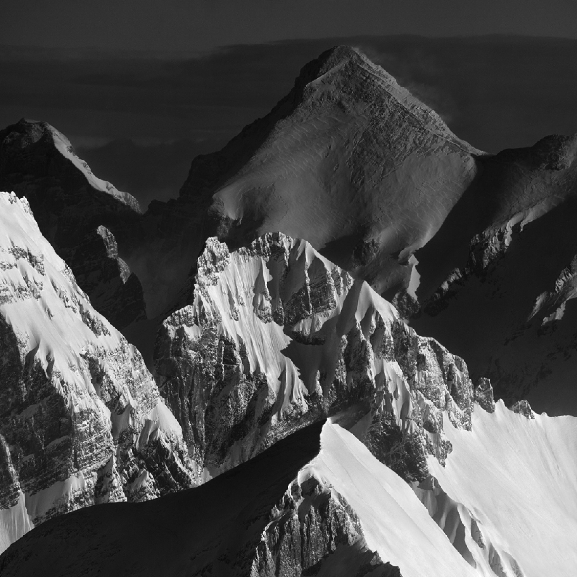
Tonal contrasts, or contrasts in light and dark, are particularly prominent in black-and-white images. Hard tonal contrasts symbolise strength, power and resilience.
‘Ebony and Ivory’ by Udo Dittmann
Soft, subtle and flat tonal contrasts represent qualities such as softness, gentleness, mildness and friendliness.
‘Curves’ by Rana Jabeen
‘Behind the pillar’ by Greetje van Son
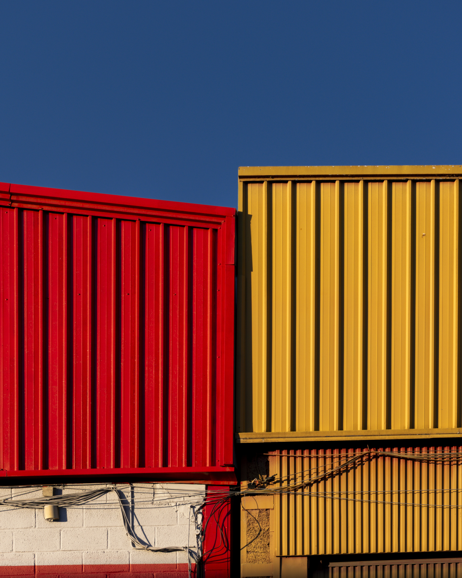
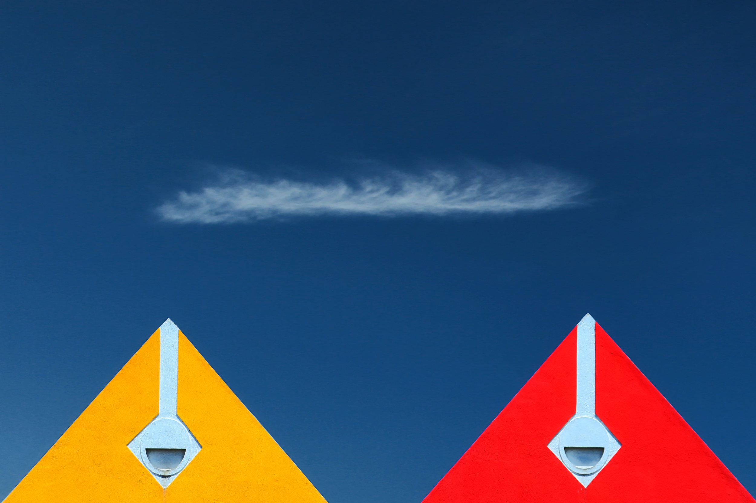
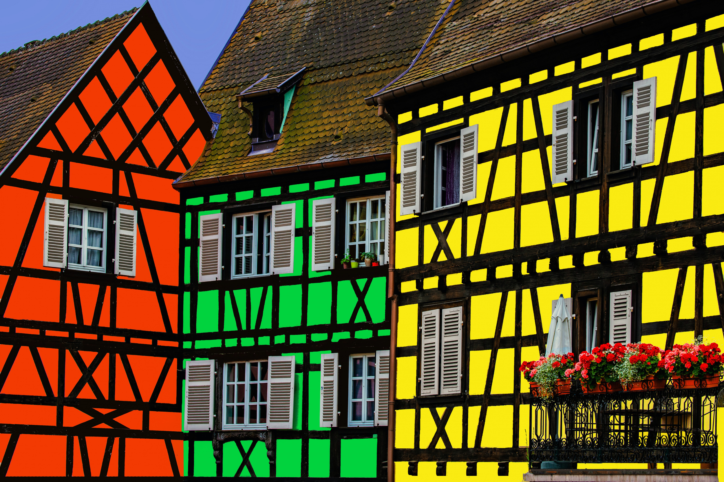
COLOUR CONTRAST ...
This involves combining at least three pure colours that are as far apart as possible on the colour wheel. 'Pure' means that the colours are not toned or only slightly toned with white or shadowed with black. This creates powerful, colourful designs, also referred to as pure colour contrast.
Untitled by Miguel Angel Vidal
This principle is particularly effective when using the primary colours of yellow, red and blue. Green is often added to this combination.
'Pyramids' by Hans-Wolfgang Hawerkamp
'Three colors houses' by Miro Susta
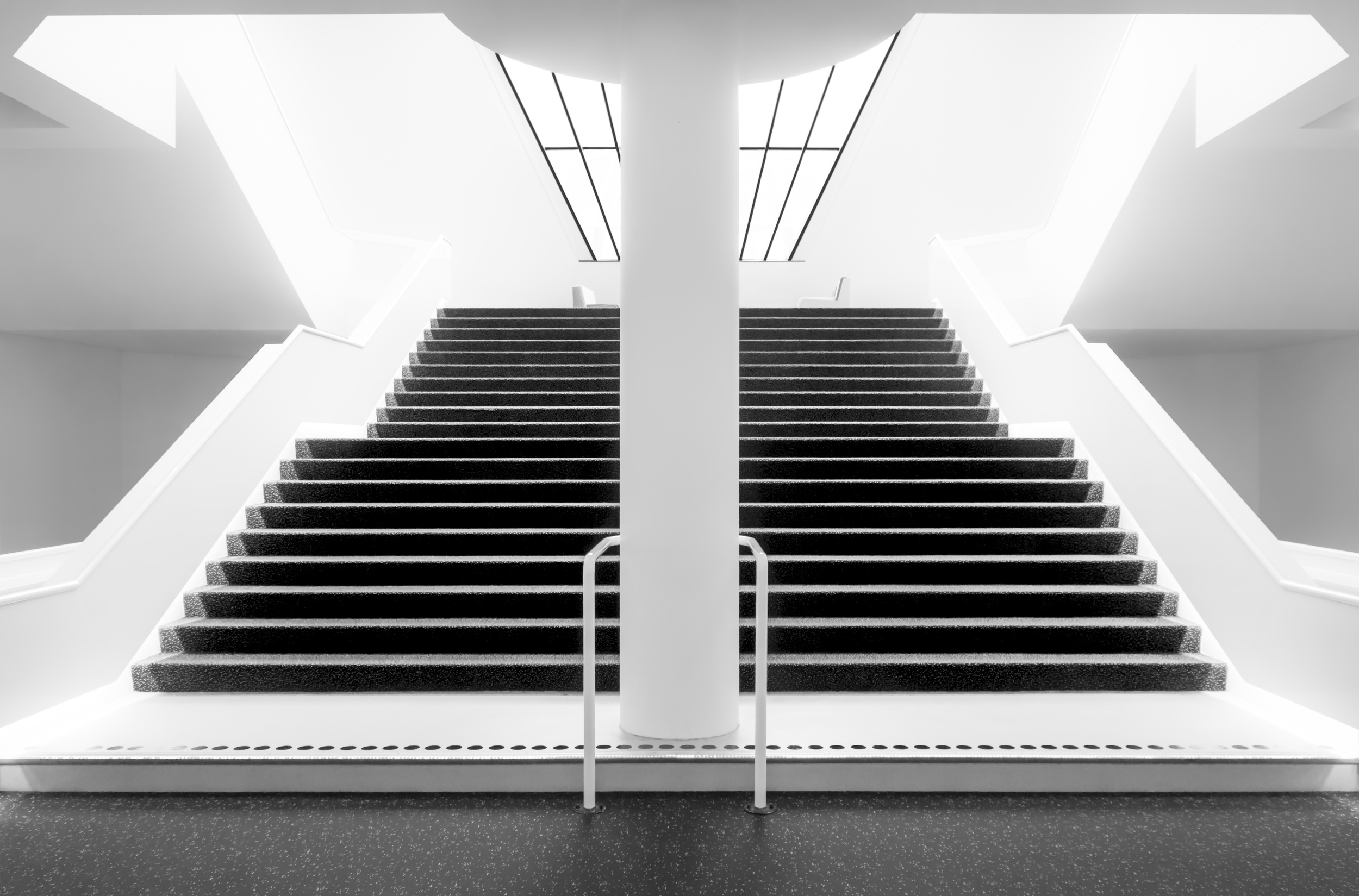
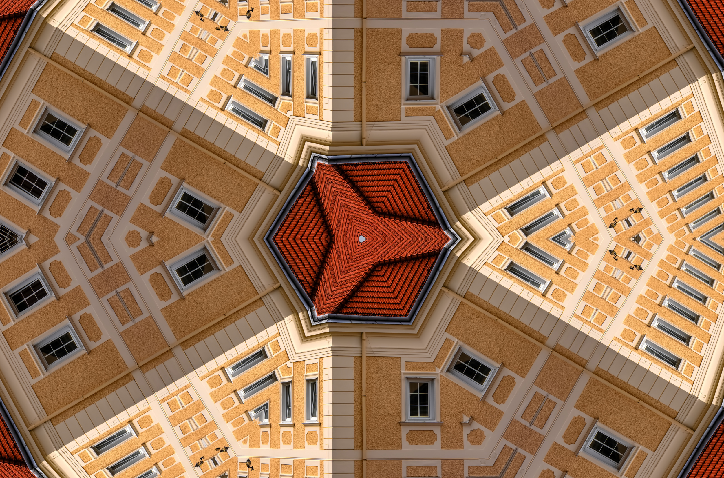
STRUCTURAL CONTRAST…
This is a visual effect created by contrasting elements that differ in structure, shape or arrangement, in order to create tension and draw the viewer's attention.
‘Sunny day’ by Luc Vangindertael (laGrange)
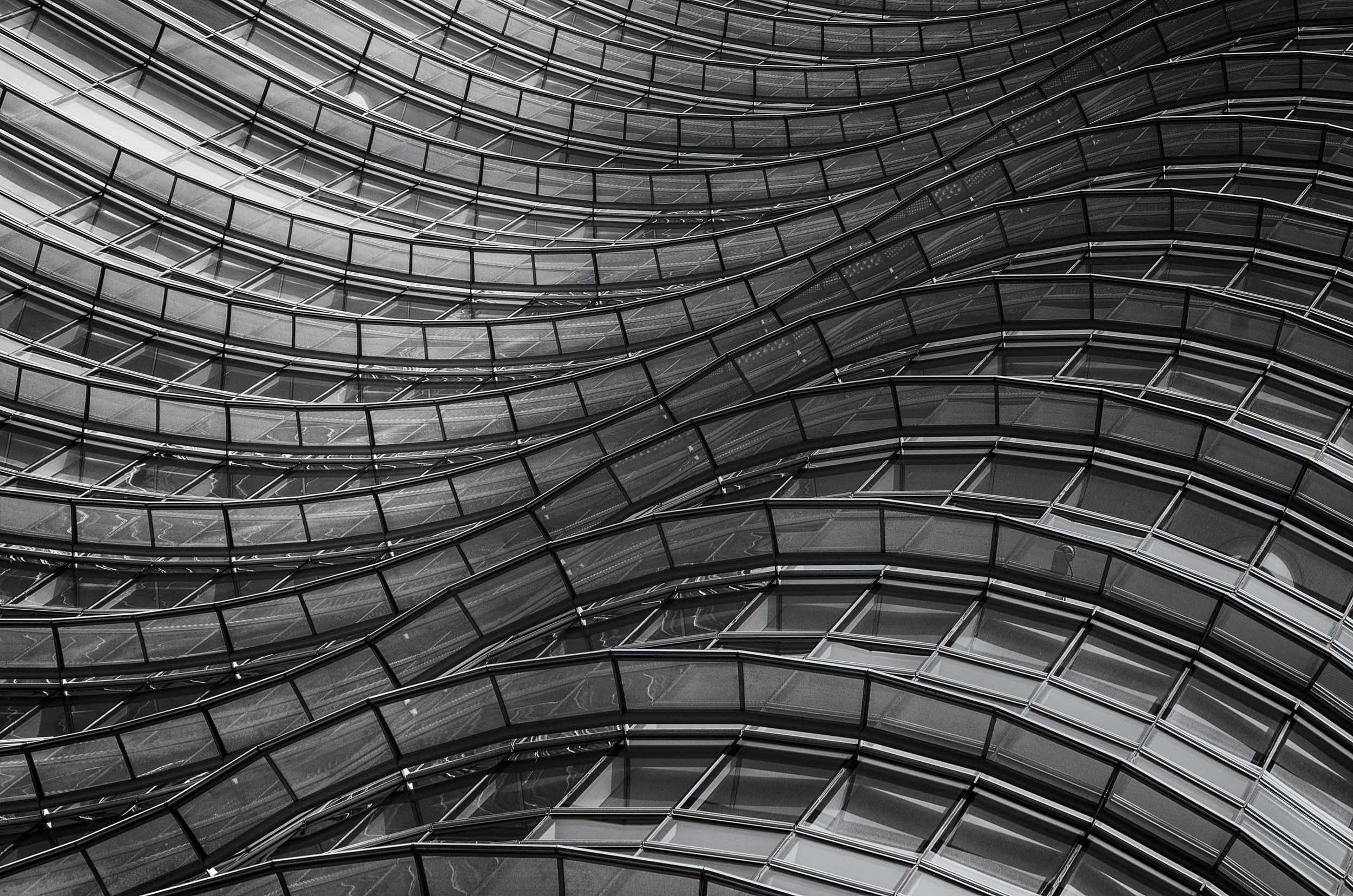
‘Structural waves’ by Francesco Bianchi
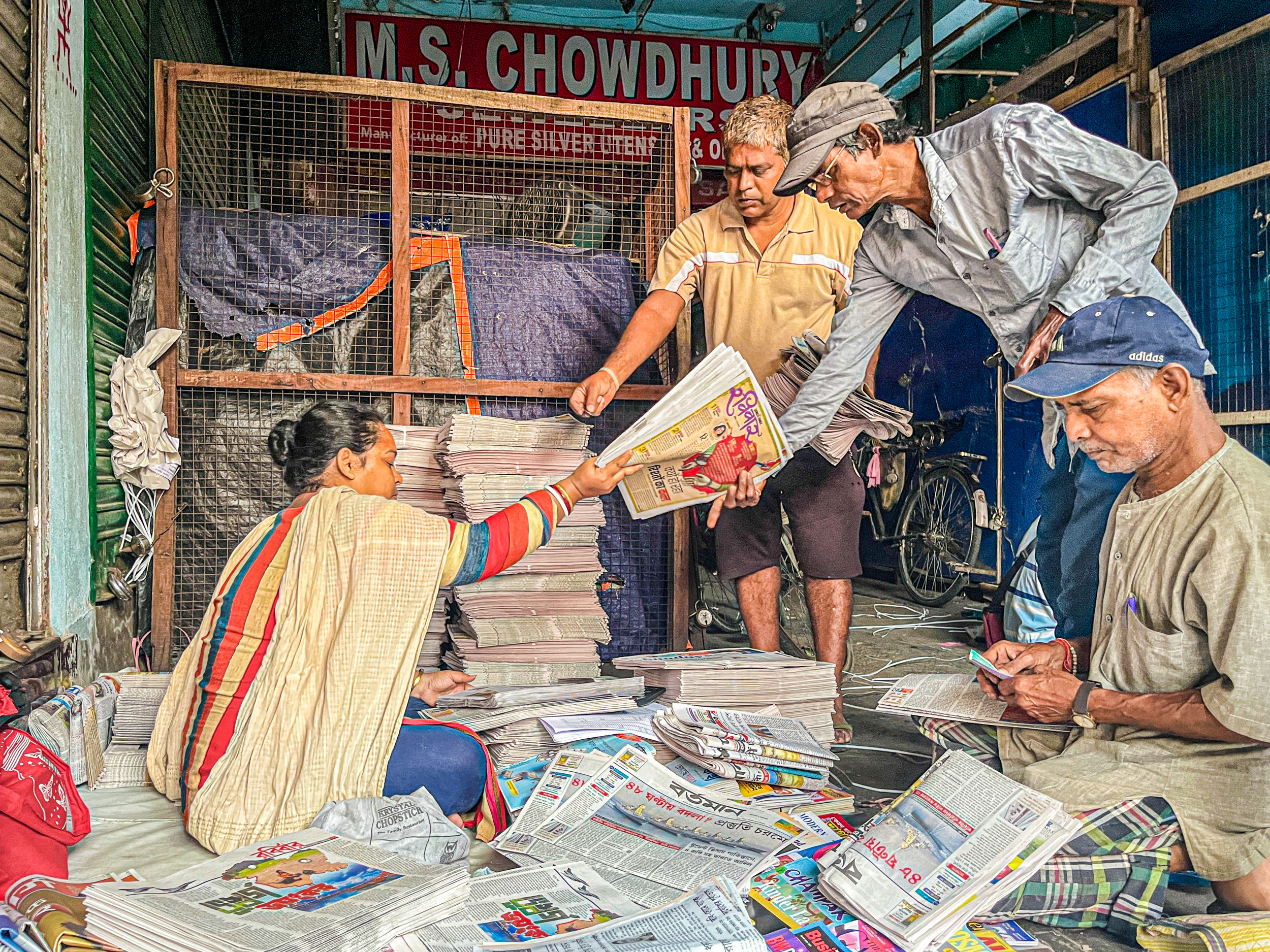
‘Kolkata News Paper’ by Subhajit Das
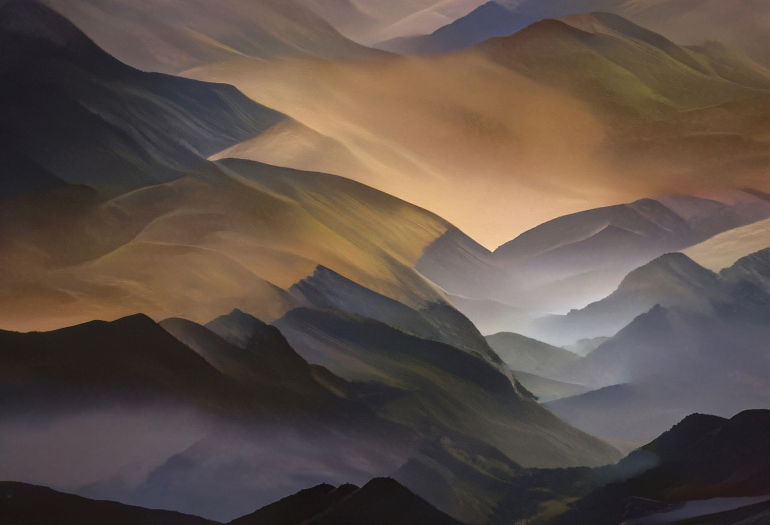
COLD-WARM CONTRAST…
Colours are divided into cool colours, such as violet and green, and warm colours, such as orange and red. Colour temperature can also be used to create three-dimensional depth and a sense of space. Cold colours appear more distant, while warm colours appear closer.
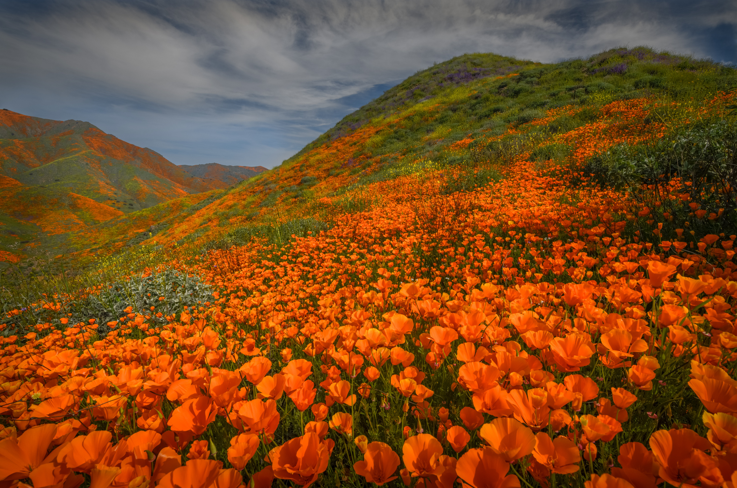
‘Poppy Bloom - Walker Cyn, CA’ by Wanghan Li
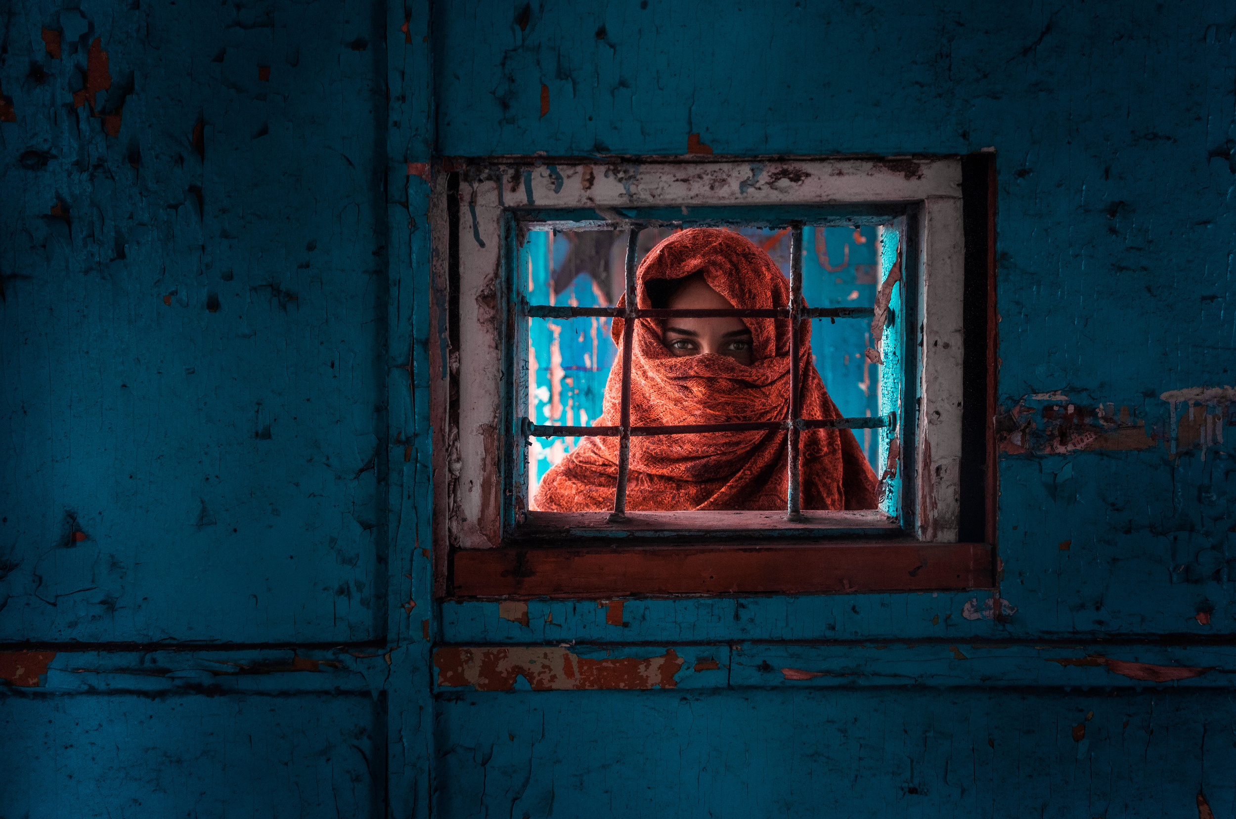
‘Face off’ by Mikhail Potapov
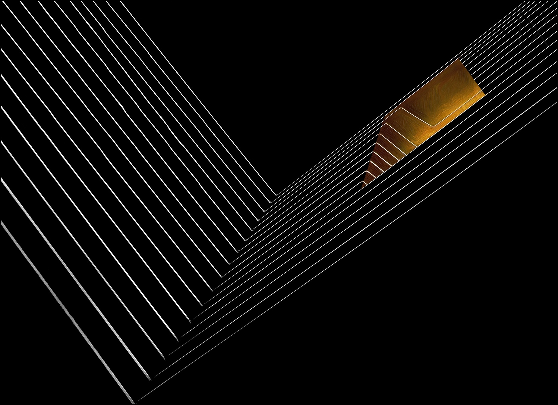
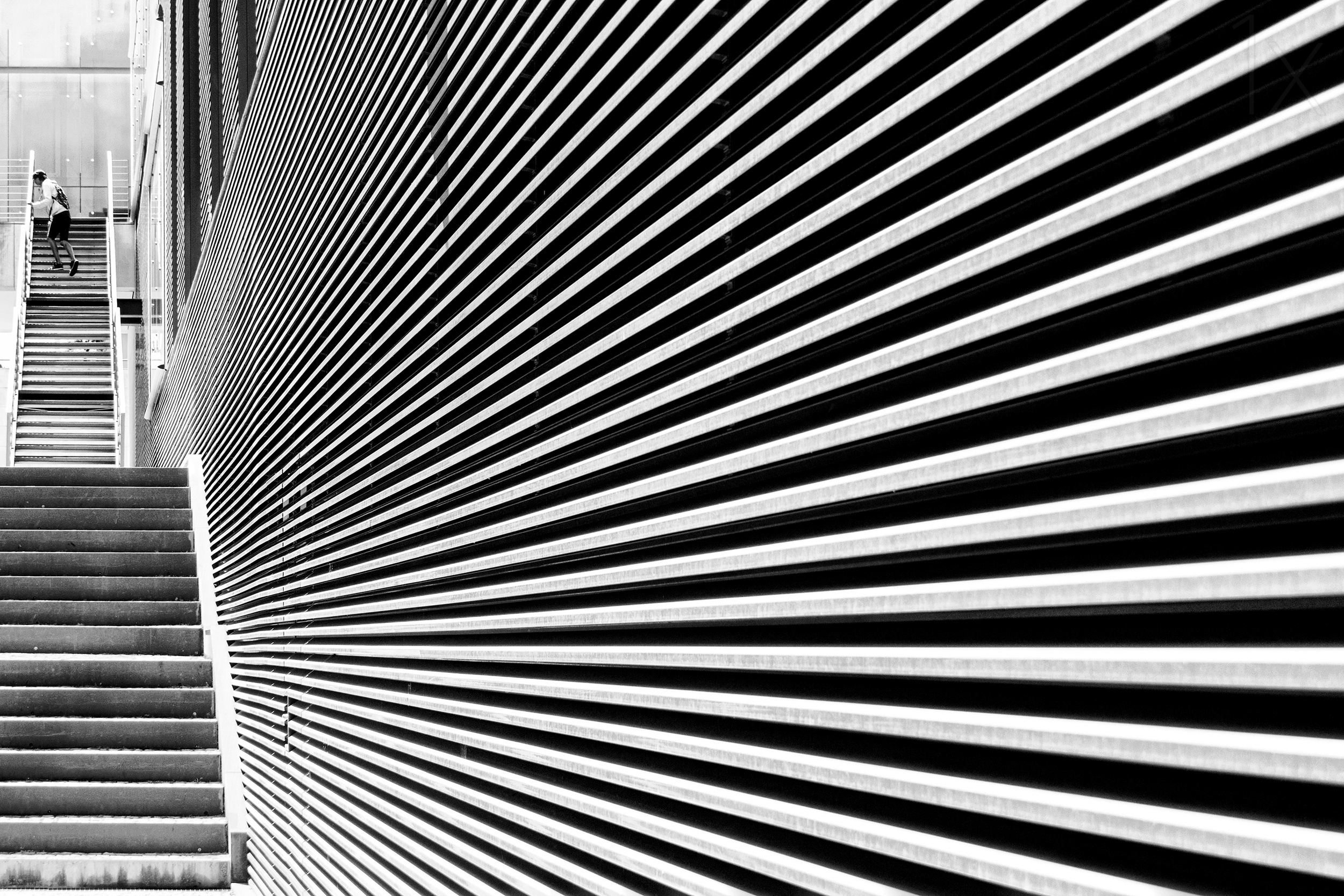
DIRECTIONAL CONTRAST…
This is created by lines that run in completely different directions. The larger the surface area, the more pronounced the contrast becomes. The effect depends on how noticeable the lines are.
‘the window and the mirror’ by Gilbert Claes
‘Funtimes In Babylon’ by Laura Mexia
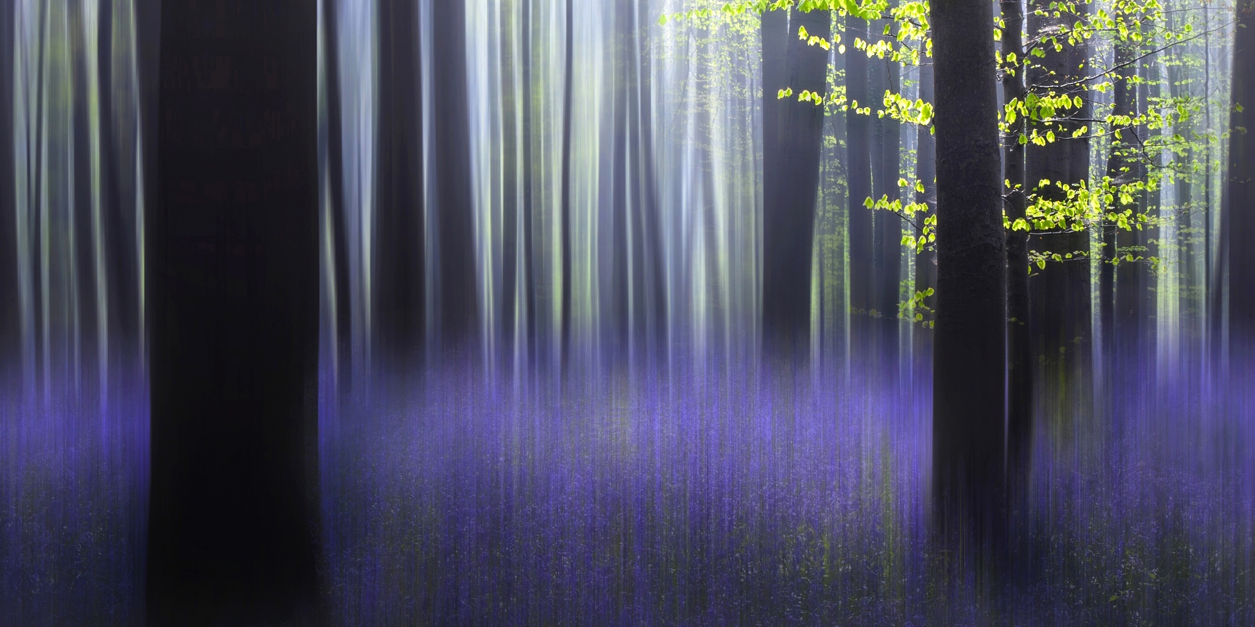
SHARPNESS CONTRAST…
This effect occurs when sharp and blurred parts of an image emphasise each other. Most viewers interpret the sharp and blurred parts of an image as being at different distances. The blurred parts of an image draw the eye to the sharp elements.
‘Haller fantasy’ by Wil Mijer
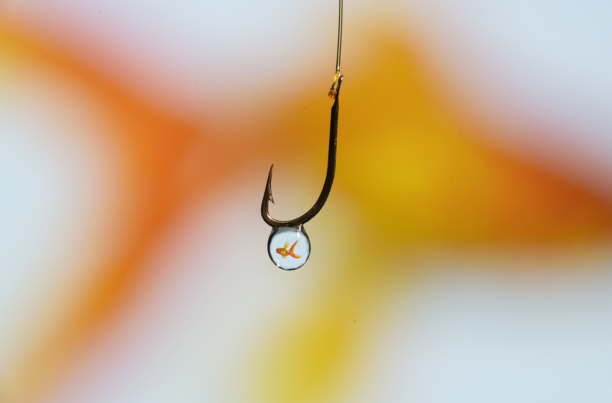
‘goldfish' by Cesare Sent
TEXTURE CONTRAST…
This occurs when objects with different textures are placed next to each other; for example, smooth surfaces contrasted with rough ones.
Generally speaking, juxtaposing different surface structures can lead to texture contrasts that attract the viewer's attention.
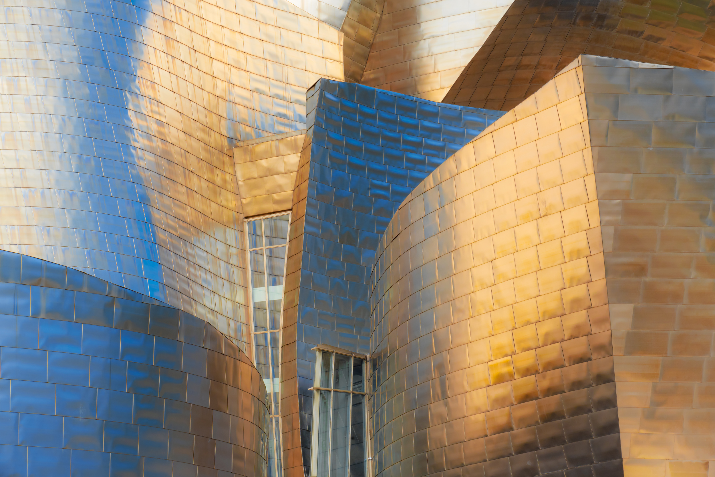
‘Gehry's Pearl’ by Mike Kreiten
‘Layers of land’ by Robin Wechsler
SHAPE AND PERSPECTIVE CONTRAST…
This arises when different types and colours of structures relate to each other. Shapes or shaped parts that are similar in size are always related to each other.
Similar shapes visually complement each other, while contrasting shapes stand out more. Contrasts, i.e. differences, can be influenced by various shape characteristics, such as shape, size and structure.
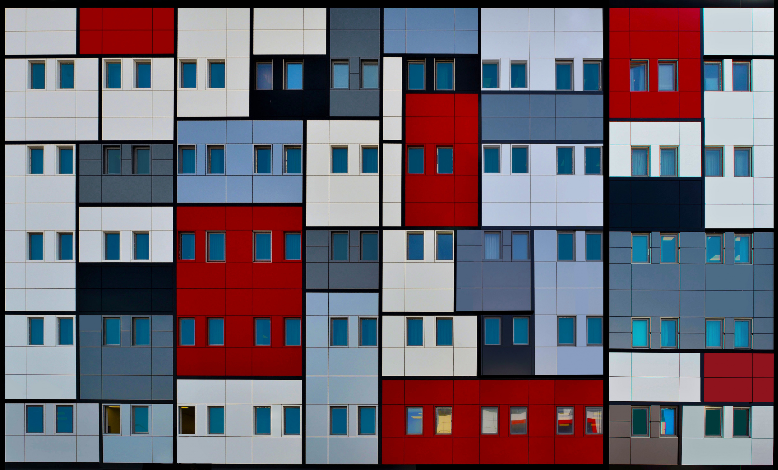
‘Shapes’ by Arnon Orbach
‘Architecture of blood’ by Jorge Pimenta
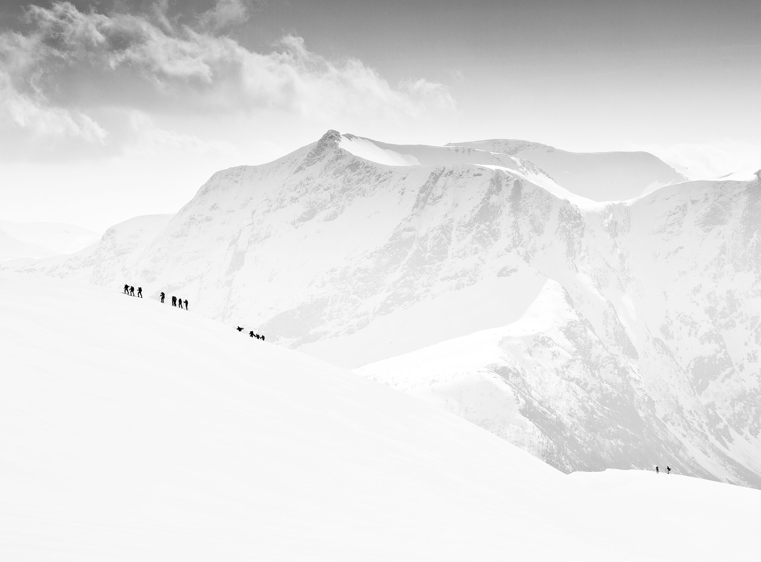
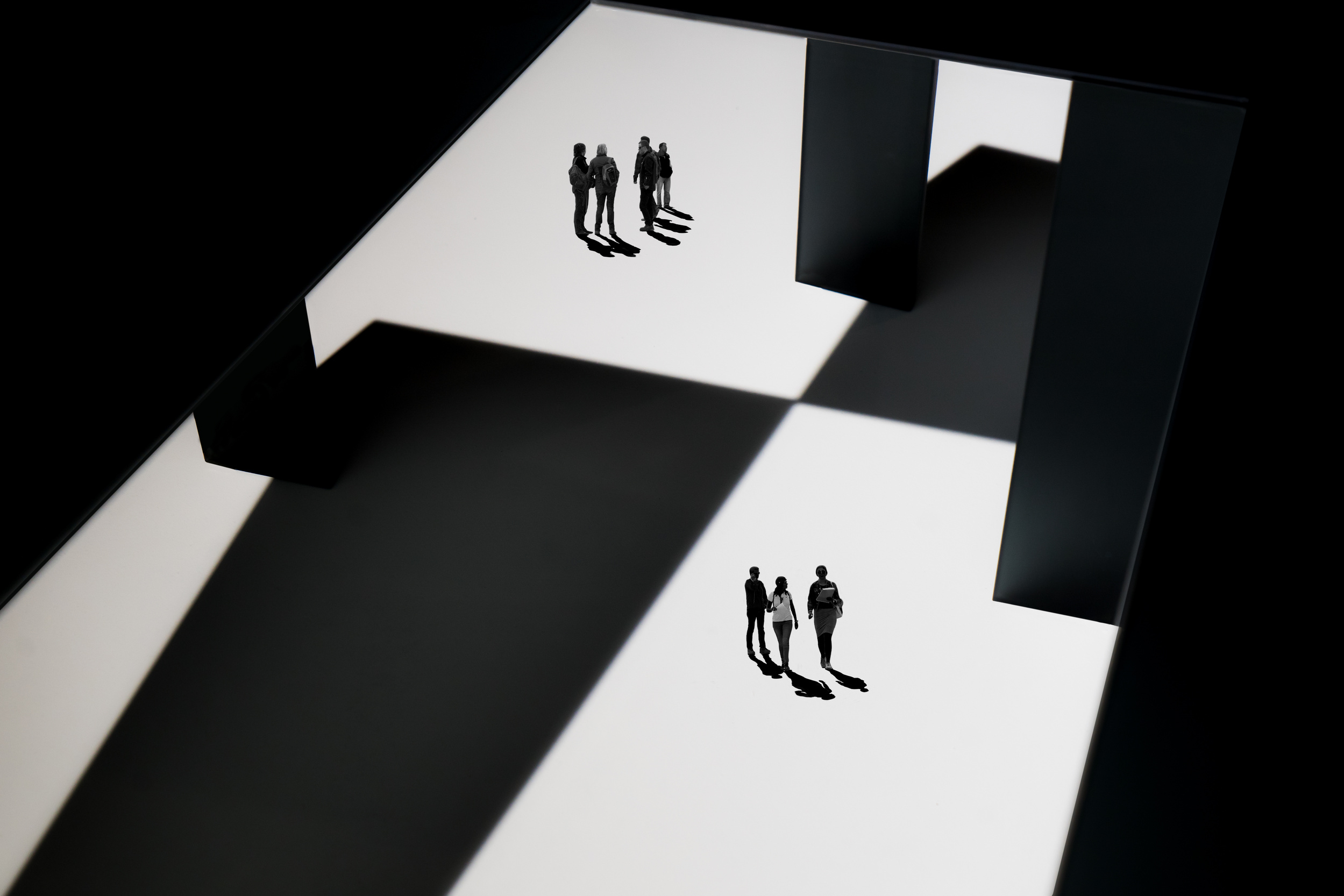
QUANTITY CONTRAST…
It is the distinction between two volumes of colour. It is strongest when a small area of colour is juxtaposed with a large area of colour; for example, a red splash on a large, distinct surface of colour. The small area of colour should be positioned within the golden section or at the centre.
‘Castle’ by Miro Susta
SIMULTANEOUS CONTRAST…
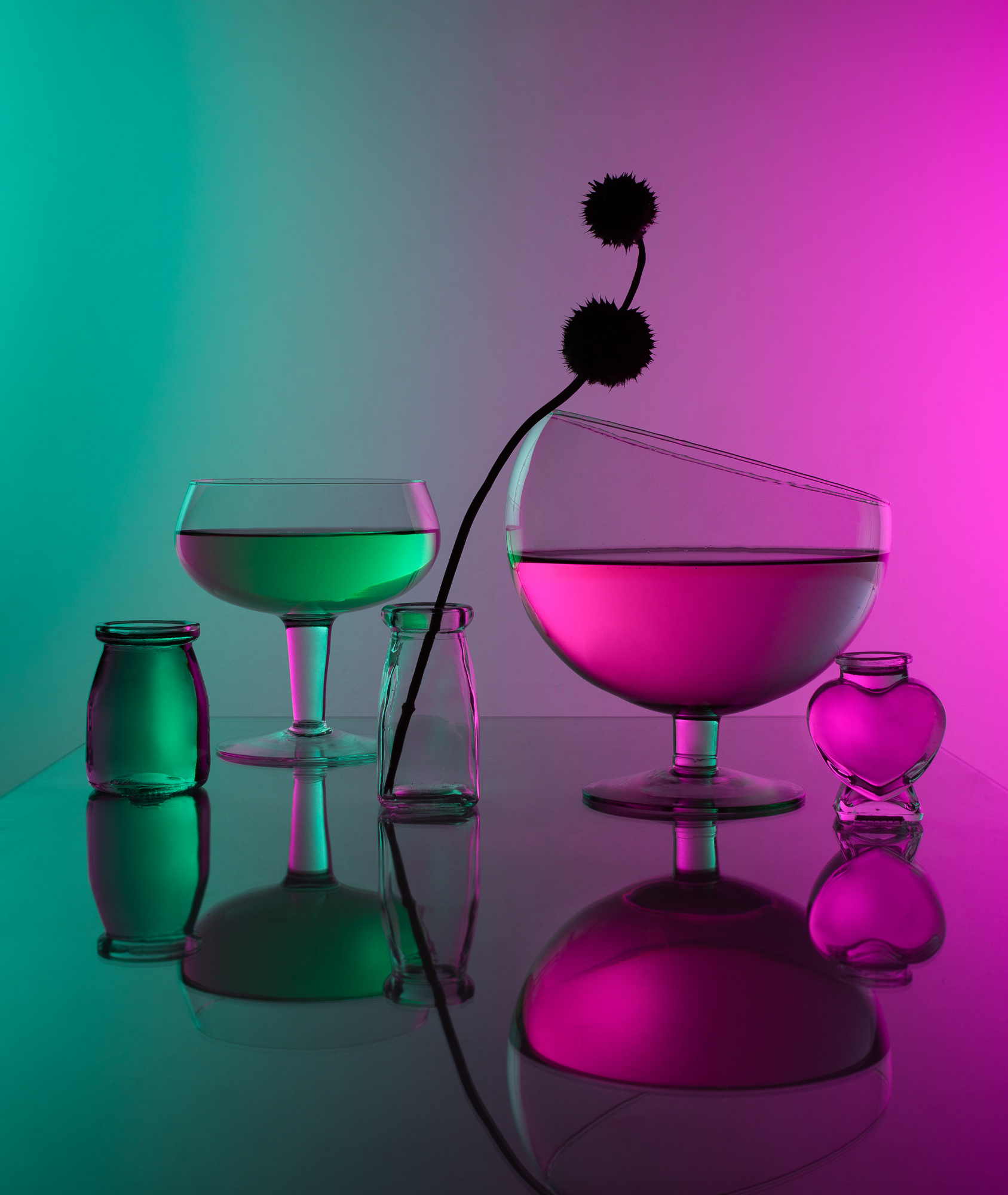
The way in which the colours of an object are influenced by the environment in which they are viewed is known as the phenomenon of colour perception. When two colours are viewed side by side, they can appear different and influence each other, creating a visual contrast. Simultaneous contrast is most intense when the two colours are complementary colours. Complementary colours are pairs of colours that are diametrically opposite each other on a colour circle, such as red and green or blue and yellow.
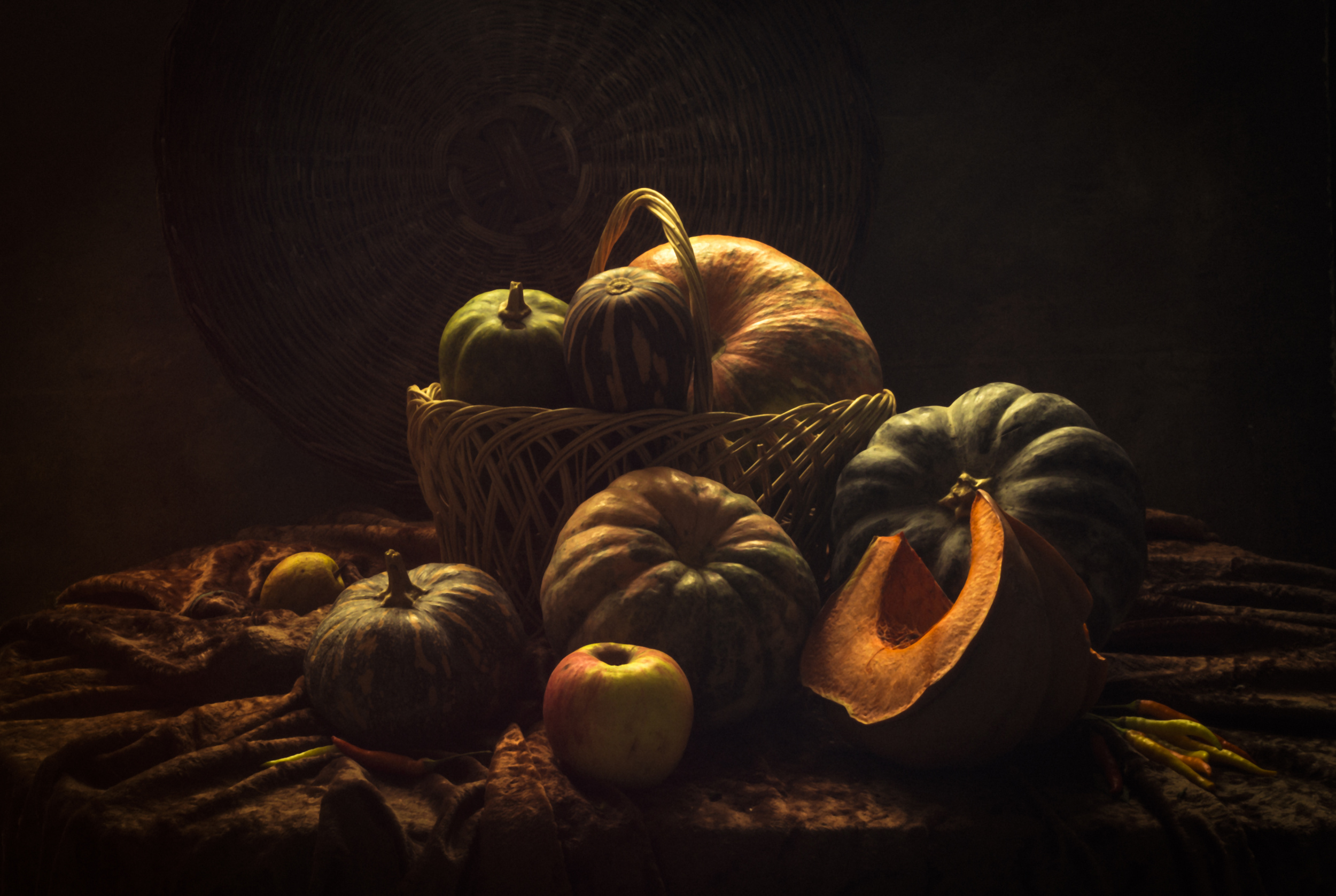
‘Still life with Many Pumpkins’ by UstinaGreen
Finally, we might ask, 'Why is contrast so important?'
Viewer guidance: The human eye is naturally drawn to areas of high contrast, making them important 'eye-catchers'.
Mood and impression: Contrasts can create a certain atmosphere; for example, sharp contrast can create an active and energetic impression, while lower contrast can create a calm and gentle mood.
Recognition of detail: Higher contrast can make details, textures and shapes in an image more visible.
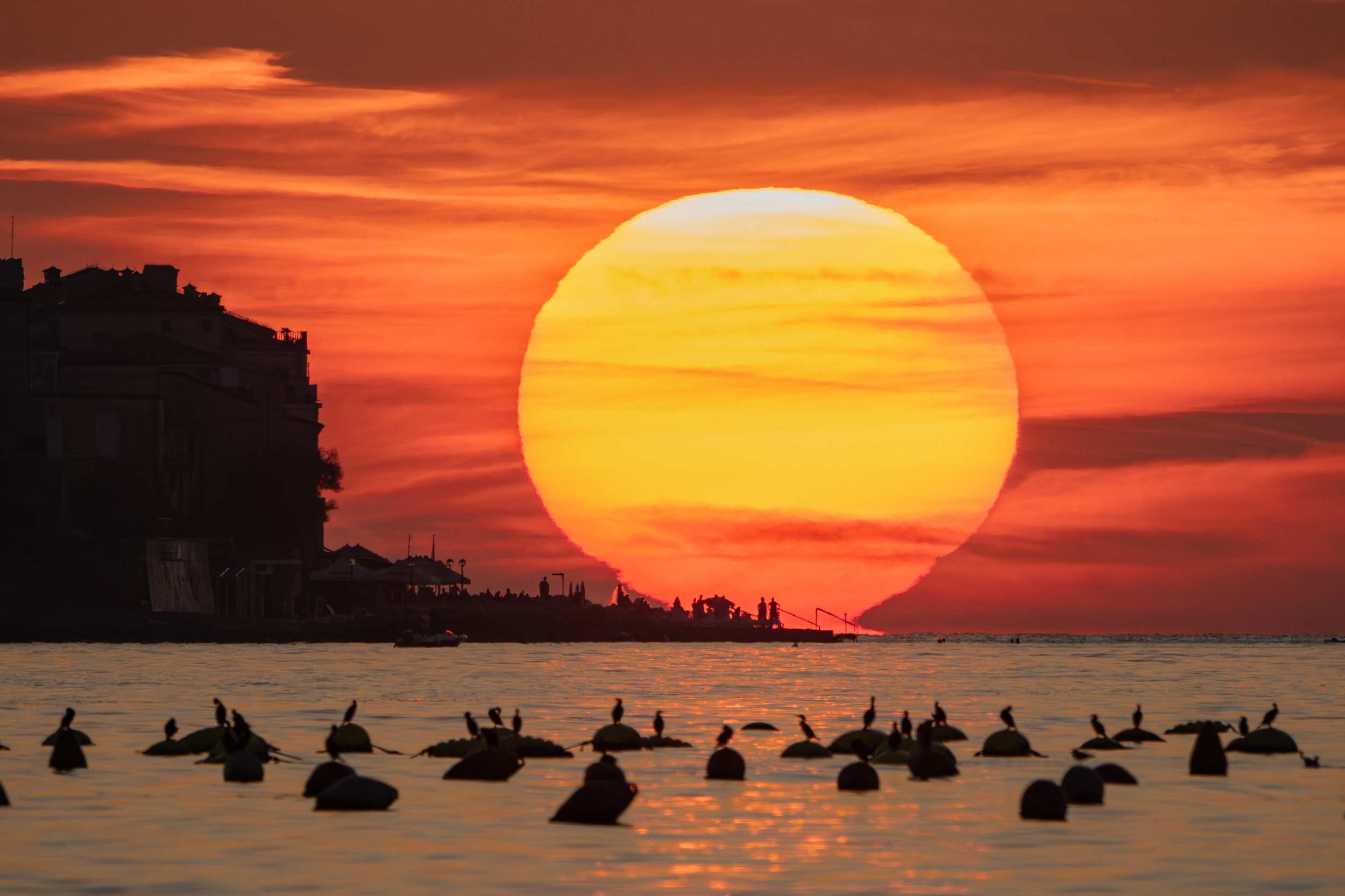
'Sunset' by Joško Šimic
And last but not least, here are two important recommendations for applying and editing contrast.
Use of light: Dramatic lighting conditions and sharp light edges can create natural contrasts; for example, during the golden hour.
Image editing: You can adjust and optimise contrast using image editing programmes such as Adobe Photoshop or Lightroom.
We can claim that photography is not just a technical method for depicting reality, but ideally a fascinating blend of technical skills and artistic vision.
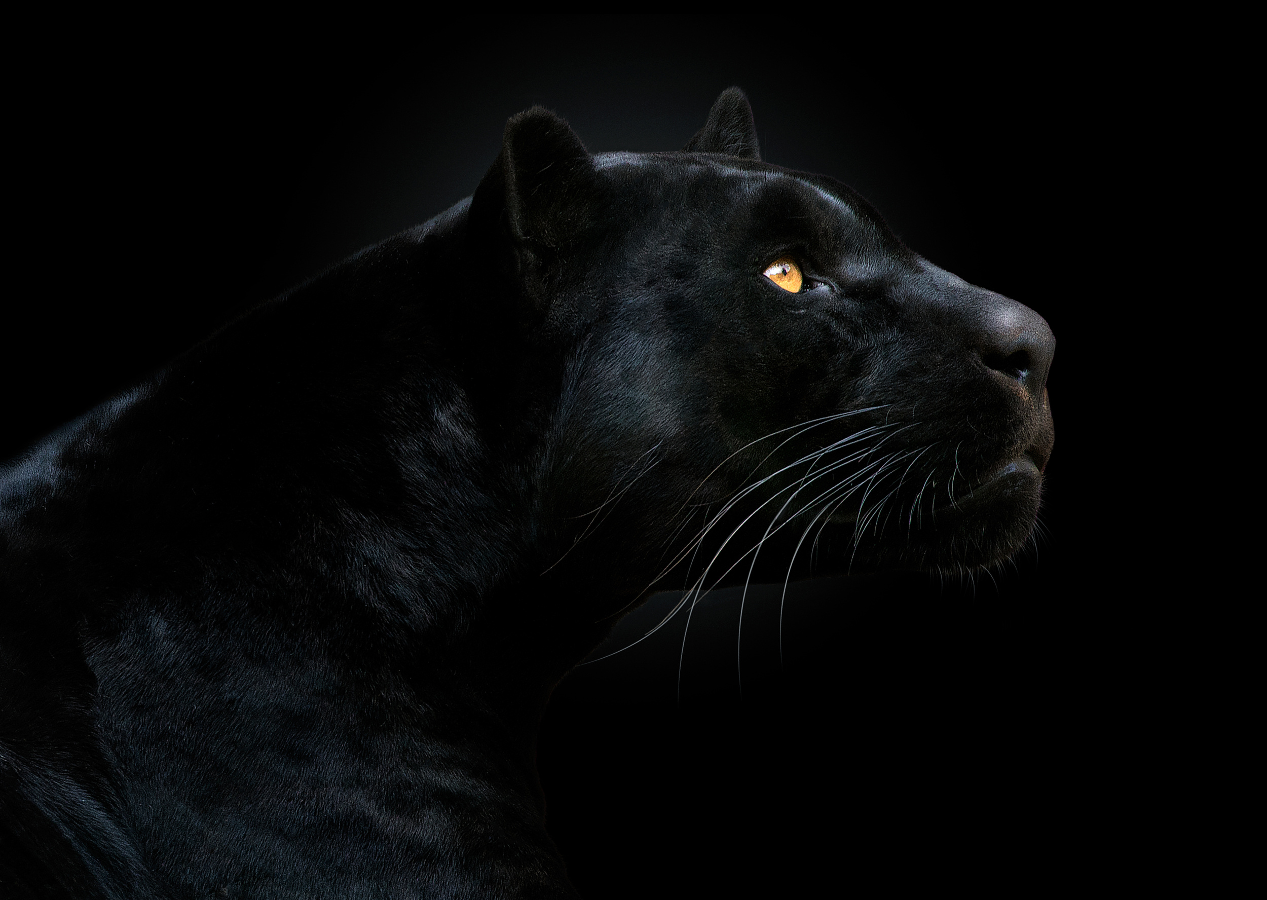
‘Son of the Night’ by Pedro Jarque Krebs
Conrad Hall, American artist said: “CONTRAST IS WHAT MAKES PHOTOGRAPHY INTERESTING”
www.mrsphoto.net
[email protected]
 | Write |
 | Lourens Durand CREW Great article, Miro. Covers a lot if different angles. |
 | Miro Susta CREW Thank you Lourens |
 | Photo Retouching LTD This article offers a profound understanding of how contrast shapes the narrative in photography. https://www.photoretouchingltd.com/
, we leverage various contrast techniques—be it tonal, color, or structural—to enhance the emotional depth and clarity of images. It's inspiring to see such a comprehensive exploration of this fundamental concept. |
| Miro Susta CREW Thank you for useful information |
 | Francisco Villalpando PRO Thank you so much for this wonderful article. A great and inspiring selection of pictures, congratulations!! |
| Miro Susta CREW Thank you very much for nice words of appreciation Francisco. |
| | Yaping Zhang PRO 图文并茂!恭喜所有人选的艺术家!感谢 Mirko 和 Yvette 的分享! |
| Miro Susta CREW 非常感谢 Yaping |
 | Robin Wechsler PRO Dear Miro, I am deeply honored to have an image included in this wonderful and inspiring article. Thanks so very much! |
| Miro Susta CREW Your excellent photos are most welcome dear Robin. |
 | Luc Vangindertael (laGrange) CREW Really interesting article with a fine selection of 1X examples. Once again strong work from the editorial theme. |
| Miro Susta CREW Thank you very much for your wonderful words of encouragement dear Luc |
 | Erik Engström PRO Thanks for an excellent article and stunning photos |
| Miro Susta CREW You are most welcome Erik |
 | Gabriela Pantu PRO Such a treat, as always.Great article and brilliant pictures, an absolute pleasure to read and admire the art of sharpness.Congratulations and thank you for sharing, dear Miro and dear Yvette.<3<3 |
| Miro Susta CREW Great thanks for your wonderful comment dear Gabriela we appreciate it very much |
 | Montserrat Alviani PRO Excellent article! Thanks for sharing.
|
| Miro Susta CREW Many thanks Montserrat |
 | Angelika Vogel PRO An impressive Portfolio! Congratulations to all! |
| Miro Susta CREW Thank you very much Angelika |
 | Nicolae Stefanel Rusu PRO Thank you so
much for this article |
| Miro Susta CREW You are most welcome Nicolae |
 | Dazhi Cen PRO Thanks. Informative and stunning examples. |
| Miro Susta CREW Thank you very much Dazhi |
 | Colin Watts PRO Thank you , very useful and full of ideas. |
| Miro Susta CREW Many thanks Colin |
 | Gerard Valckx PRO A fine article about the contrasts and the variation on that theme.
Contrasts is a part of photography that i like to use its a powerful tool in the post proccesing of our photos. Many thanks for sharing this closer look and with the very fine pictures of several members.
Thanks, Miro and Yvette. Complements!! |
| Miro Susta CREW Thank you very much for your wonderful comment dear Gerald we appreciate it very much |
 | Gila Koller PRO thank you for a very interesting article with excellent examples Miro and Yvette. |
| Miro Susta CREW Thank you very much Gila |
 | Udo Dittmann PRO Wonderful, very informative article. I am honored that one of my pictures is part of it. Special thanks go to Yvette and Miro. |
| Miro Susta CREW Thank you very much for your nice comment and also for your wonderful photo dear Udo |
 | Elizabeth Allen CREW Thank you for this excellent article and collection of photos, Miro. Thanks as always to Yvette. |
| Miro Susta CREW Many thanks for your wonderful words of encouragement dear Elisabeth we appreciate it very much |
 | Subhajit Das PRO Great article and stunning images. Very inspiring. Thank you so much Editor Miro Susta and Editor Yvette Dapaepe. It is a great honour for me. Congratulations to all authors. |
| Miro Susta CREW Many thanks for your wonderful comment dear Subhajit we appreciate it very much |
 | Eiji Yamamoto PRO Thank you so much for a very interesting and wonderful article with great photos! It's very inspiring! |
| Miro Susta CREW Thank you very much for nice words of praise dear eiji |
 | Wanghan Li PRO Excellent writing with the beautiful and artistic works! Appreciate very much your time, effort and enthusiasm in doing this! Learning and learning. |
| Miro Susta CREW Great thanks for your wonderful words of appreciation dear Wanghan |
 | Margareth Perfoncio PRO Thanks a lot dear Miro and Yvette! |
| Miro Susta CREW You are most welcome Margareth |
 | Jane Lyons CREW Thank you Miro. I learned a lot that I did not know about post processing Contrast. The examples you sighted are perfect. Thanks, too, Yvette. |
| Miro Susta CREW Great thanks for your wonderful words of encouragement dear Jane |
 | Joško Šimic PRO
Great article and stunning images! Thank for editing one of my photo dear Miro and Yvette ❤️
|
| Miro Susta CREW Thank you very much Joško |
 | Thierry Dufour PRO Thank for editing one of my photo dear Miro and Yvette !!! |
| Miro Susta CREW You are mist welcome Thierry |
 | Jacob (Jian) Xu CREW Great article and stunning images! Thanks to Miro and Yvette! |
| Miro Susta CREW Thank you very much dear Jacob |
 | Gilbert Claes PRO I read with great interest about the variety of components to which the theme “abstract” can be applied. Wonderful work by Miro to substantiate this with a special selection of photos from the rich and artistic offerings of 1x.com. It is a great pleasure to contribute to this. Many thanks to Yvette and Miro for their excellent work and congratulations to the selection of photographers. |
| Miro Susta CREW Thank you very much for your wonderful words of encouragement dear Gilbert we appreciate it very much |
 | MingLun Tsai PRO Great article and images! Congrats to all artists! Thanks Mirko and Yvette for sharing! |
| Miro Susta CREW Many thanks MingLun |
 | Lus Joosten PRO Great Selection. I like this. |
| Miro Susta CREW Thank you Lus |
 | Hans-Wolfgang Hawerkamp PRO much remarkable article with a great selection of work that matches the content. Thanks a lot dear friend Mirko and dear Yvette |
| Miro Susta CREW Many thanks for nice words of praise dear Hans-Wolfgang |
 | Greetje van Son PRO A very interesting article with striking examples. Miro. A pleasure to read ant look at. Thanks a lot for choose one of my photo's for this purpose. And Yvette thanks for publishing. |
| Miro Susta CREW Thank you very much for your lovely comment dear Greetje |